Your logo (which typically resides in the top left corner of your website as well as front and center on your print materials such as business cards and letterhead) will be the first point of contact with a potential client.
If they connect with your brand, the likelihood of them engaging with your firm is increased.
A well-designed logo should reflect your approach to practicing law while setting you apart from your competition and conveying your professionalism to potential clients.
Logos need to be not only distinctive, but effective and sustainable.
What are logo elements?
Although the general public will most likely not develop an immediate strong connection to your logo like they have with well-established international brands, acknowledging the elements and psychology that make a well-designed logo will help you understand its importance when it comes to long-term branding and marketing.
A law firm’s branding should convey a sense of trust, authority, and professionalism to its existing and potential clients.
Conveying this message means that the elements of your logo—from the fonts to its logo mark and color scheme must work cohesively to produce appealing imagery.
A logo is composed of the following elements:
- Logomark – an image or a symbol which represents the firm
- Logotype – firm name designed in a customized way

When you look at a logo, your brain is analyzing it by its color, shape, and ultimately, its meaning.
Moreover, the way our brains process logos can affect our emotions based on the connotations and experiences we have with certain brands. A logo is basically a receptacle that delivers the meaning of your brand.
There are a lot of factors to consider that might not come naturally to a non-designer, but the “sweet spot” of the perfect logo often lies within the collaboration of the client (that’s you!) and your design team (which, if you’re lucky, could be us)!
What makes a well-designed logo?
The ultimate goal behind creating a logo is building strong brand recognition.
Here are some guidelines for a well-designed logo:
Shape
Human mind perceives balanced design as more appealing. For optimal results, keep things evenly distributed.
Most memorable logos abide by K.I.S.S. principle = Keep It Simple, Stupid.
This principle states that the logo performs best when it is simple rather than complex and excessive. For strong impact, leave out all unnecessary elements. And we strongly recommend avoiding “trends” such as 3D effects or designs that depends on color for them to make sense. (The well-designed logo looks good even in monochrome black and white variation.)
Aim for simple and timeless design.
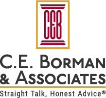
Example of simple logo design:

Color
Color is used to evoke emotion and express personality.
When it comes to visual perception, the brain reads color after it registers a shape and before it reads content.
Our perception of color is tied to emotion.
This is why many legal brands use blue and black as their brand colors.
Blue conveys trustworthiness, security, and honesty, while black evokes feelings of authority, formality, and sophistication.
In most cases law firms shy away from bright colors; however, such colors could be appropriate for your law firm based on your primary practice area focus.
For example, if you focus on offering legal aid to small businesses in the hospitality industry – red, orange or yellow could be a perfect fit.
If you’re not sure where to start with choosing your colors, it’s best to know what NOT to do. We recommend against using colors that are too bright or can hurt the eyes when viewed, colors that clash, or colors that feel like they evoke stress or panic.
And remember: within each color category, there are literally thousands of shades and variations to consider, each with its own unique feeling.
Color associates us with a meaning that communicates the desired position within the marketplace:
Typography
It probably goes without saying that a law firm’s logo should avoid fonts that are difficult to read.
Comic sans might work for a lemonade stand but it has no place on a business website of any kind.
Ideally, your font should be easy to read while conveying a sense of authority, trustworthiness, and professionalism.
Typefaces should be chosen for their legibility, their unique character and the range of their weights and widths.
Limiting the number of fonts used in the logo is also very important. We recommend sticking to 2 fonts maximum, as this helps to avoid confusion, improves the legibility of a logo and improves brand recognition.
Many firms choose serif and sans serif faces, while others stick to one font family (this is a matter of preference rather than a design specification).
Example of balanced typography choices:
Logomark
Like color, your logomark / symbol is also tied to emotion.
Creating a unique logomark that reflects your niche of law can separate you from your competitors and help develop a stronger level of brand recognition.
A logomark should embody and imply what you do and why you’re unique while addressing the clients’ needs and wants. (Sounds like a tall order for a logomark, right?)
Types of logomarks:
- Wordmarks: a freestanding word or words, firm name or acronym. The best wordmarks contain legible words with distinctive font characteristics.
- Letterforms: one or more letterforms as a distinctive graphic focal point.
- Emblems: a mark in which the company name is inextricably connected to a pictorial element.
- Pictorial marks: an immediately recognizable literal image that has been simplified and stylized, that alludes to the name of the firm.
- Abstract / Symbolic mark: symbol that conveys a big idea and embodies strategic ambiguity. These work best for big firms with numerous and unrelated divisions.
Size
An effective logo is legible at all scales.
If the logo loses too much definition across different media applications (billboard, business card etc.), the impact of it lessens.
When designing a new logo, it’s important to test its viability against a group of real applications – such as a business card, homepage, advertisement, brochure covers, signage, letterhead and maybe a fun application such as a tote bag.
It’s crucial that the effectiveness of the identity works across all media applications.
Legends Legal Marketing is here to help with all your brand and web development needs!
While you should ultimately work with a professional agency for the development of your logo, there are some tips you can consider to help you determine the types of logos that speak to you.
We recommend taking a look at the logos of your competitors.
What types of shapes, colors, and fonts appeal to you?
Are there specific images you want to include like Hellenic columns, the scales of justice, or olive branches?
Taking notes before consulting with a professional can help streamline the logo creation process and ensure that the samples you receive reflect your taste.
At Legends Legal Marketing, we serve attorneys throughout the United States. From logo and website design to content production and social media marketing, our team can help you expand your client base and build recognition within your community.


